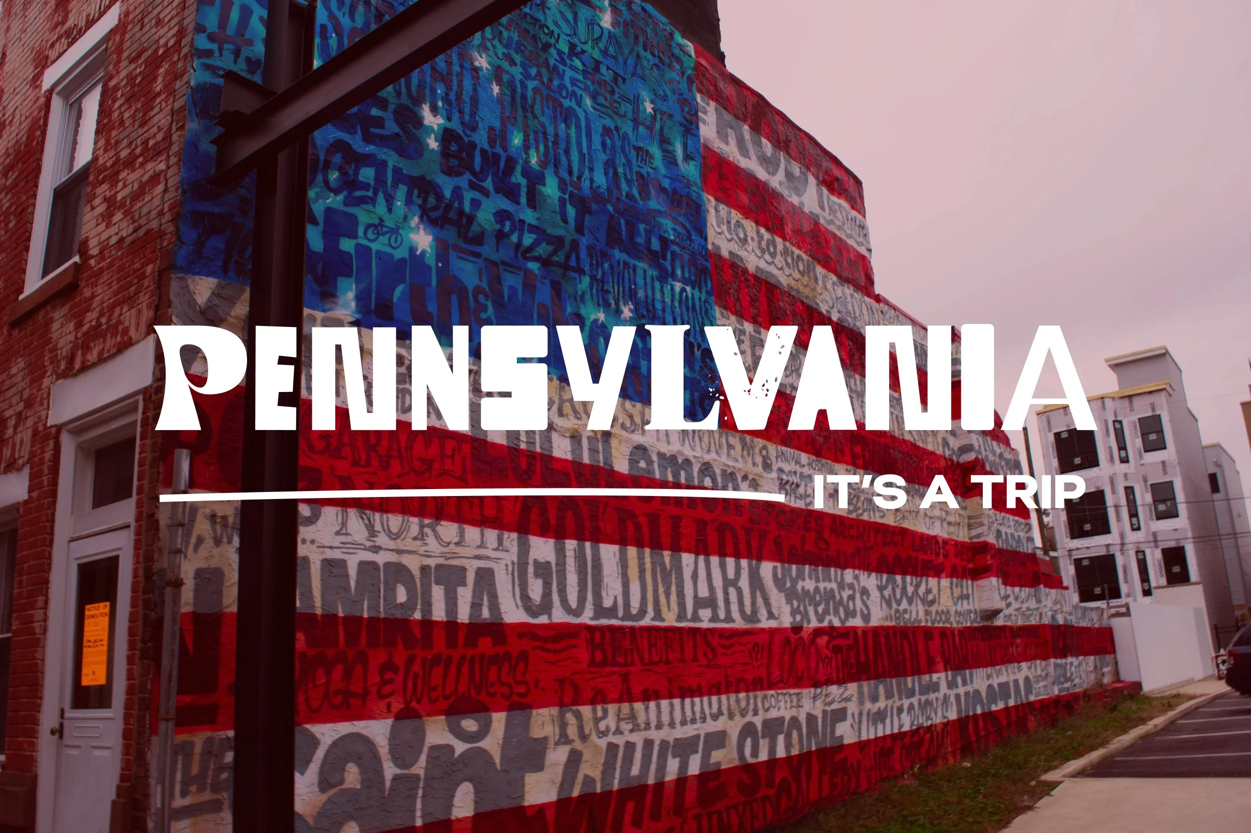


Pennsylvania needed a brand that could break through outdated perceptions and reveal the state as a vibrant destination full of personality, surprise, and emotional connection. Instead of promoting attractions alone, the strategy repositioned Pennsylvania around an attitude: it’s not just what you see—it’s how you feel while you’re here.
I led the creative team in developing the brand identity system, working closely with the Deputy Secretary for Tourism and training the partner advertising team on how to bring the brand to life. The visual system was built around a set of distinctive visual codes—shapes, cues, and colors—that added layers of meaning tied directly to the brand strategy. These elements highlighted the quirk, specificity, and emotional resonance that make a Pennsylvania trip memorable long after it’s over.
The result is a flexible and expressive identity that invites travelers to embrace the unexpected, bond through shared experiences, and discover that in Pennsylvania—it’s not just a trip. It’s a TRIP.